House of Commons – taken from Wikipedia.
I already posted a short version of this on Twitter, so if you want a much less detailed analysis, it’s worth reading there instead. Essentially, I was told in a meeting yesterday that Labour always (emphasis mine, but reflective of what was being said) lead to a worsening of the economy. This was part of a wider discussion on whether rich people actually flee the country when tax rates are higher (a la the Laffer Curve), but the specific comment was that the economy always suffered after a deferred period of about five years. As a finance professional, this piqued my interest and didn’t sound exactly right, so I thought I would refresh my memory on Labour vs Conservative when it comes to the economy.
The Claim
I am trying to be as fair as I can possibly be here, but it was a pub discussion without access to actual data, so the terms are more loosely defined than I would prefer. Nevertheless, the claim made was that the economy always suffers under a Labour government and recovers under a Conservative one. The concept of a delay of around five years was added after I mentioned that I had looked many times at both the FTSE 100 and GDP charts, and I had never been able to spot such a pattern, but the interlocutor was 100% certain that this was the case.
FTSE 100
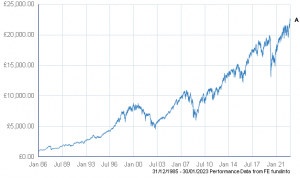
Once I got home, I decided to visit Trustnet to get a chart of the FTSE 100 over time. For those not in the know, this represents the performance of the 100 largest companies traded on the London Stock Exchange, so it is a measure of the overall strength of the economy in one form, albeit not perfect. It is the most-quoted indicator of how the UK stock market is doing, and you will see it on various news programs simply referred to as the “Footsie”.
This index was launched for the first time in 1984, so getting data before that date is much harder. I confess, I have not put in that effort. In my view, the chart since 1984 does not show any data that I feel would make the effort of going back further worthwhile.

FTSE 100 since launch in 1984. Hard to spot any patterns attributable to party in power.
I haven’t done any sort of regression analysis on this data, so my conclusions are just a result of “eyeballing” the chart, but I cannot see any observable pattern which could be attributed to the change in governments in 1997, 2010 or 2015. As such, I decided to look at another measure.
GDP

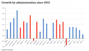
Growth by administration in GDP since the 50s. Importantly, no reliable pattern of GDP being lower when Labour come into power.
Gross Domestic Product, or GDP, is a measure of how much value is being produced within an economy per capita. It is probably the most used indicator of the strength of an economy, and indeed GDP is used as the sole metric for whether an economy is growing or in recession.
GDP is a much longer-recorded metric, as it has been used as the fundamental underpin of our economy for well over a century. I did not decide to do primary research on this subject, as I don’t believe I have much to add in terms of analysis, but I did find a very comprehensive-looking analysis here. I must stress, I have not checked this publication for robustness, but the figures seem to agree with what I have experienced in my years of work with finances.
Their summary is interesting from a statistical perspective. Their conclusion is that the two main parties in the UK achieve approximately the following:
- Conservatives:
- Mean quarterly GDP growth of 0.62%
- Median quarterly growth of 0.58%
- Labour:
- Mean quarterly GDP growth of 0.56%
- Median quarterly growth of 0.62%
If you’re not familiar with the mathematical terms, mean is the average growth rate, while median is the typical growth rate. As such, both figures are important for statistical analysis, and if there was a significant difference between the mean and median, that would indicate more extreme periods of either growth or contraction.
Importantly, taking the absolute best figure for the Conservative party of 0.62% vs the Labour party’s 0.56% (ignoring the fact that Labour’s lower difference to median indicates more reliability of GDP growth for the economy), this equates to about 11% outperformance.
It is, however, important to consider a few factors:
- Some periods of performance will be attributable to the previous party, as changes take time to report.
- GDP is purely an arithmetic mean. In theory, one person could massively increase their wealth and GDP would be reported as positive. It says nothing about the well-being of people in that society.
- This analysis ignores error bands which should be applied to all forms of statistical analysis. It is quite possible that this difference is not statistically significant when factoring in those error bars.
- Also ignored are the things that might not count towards GDP, for example having a functioning NHS. This is particularly relevant now, as we have a failing NHS and a troubled economy.
Conclusion
There is no evidence that there is a pattern to economic growth linked to a change in the majority party in government. Unfortunately, this is another example of a very widespread falsehood that has been spread by those who want to manipulate political power. Most people do not have the mathematical confidence to go looking for the data. I do.
This claim is false. Numbers simply do not back up the assertion. Conservative and Labour parties are both equally competent (or incompetent) at managing the economy.
The follow-up to this claim is that if we assume that Conservatives represent lower taxes and Labour represent higher taxes, there is no evidence that the party of higher taxes reliably reduces growth by a significant margin.
Importantly, this shows that the country’s growth as a whole does not suffer just because of higher taxes or funding of the public sector. This means that the higher taxes required on wealth for something like Universal Basic Income (or anything else from my personal manifesto) are highly unlikely to have an impact on the growth of the country as a whole.
